Byron’s BBQ
Art Direction for Responsive Website Redesign
2014
Byron’s BBQ
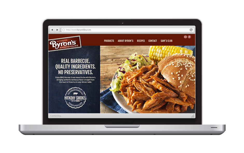
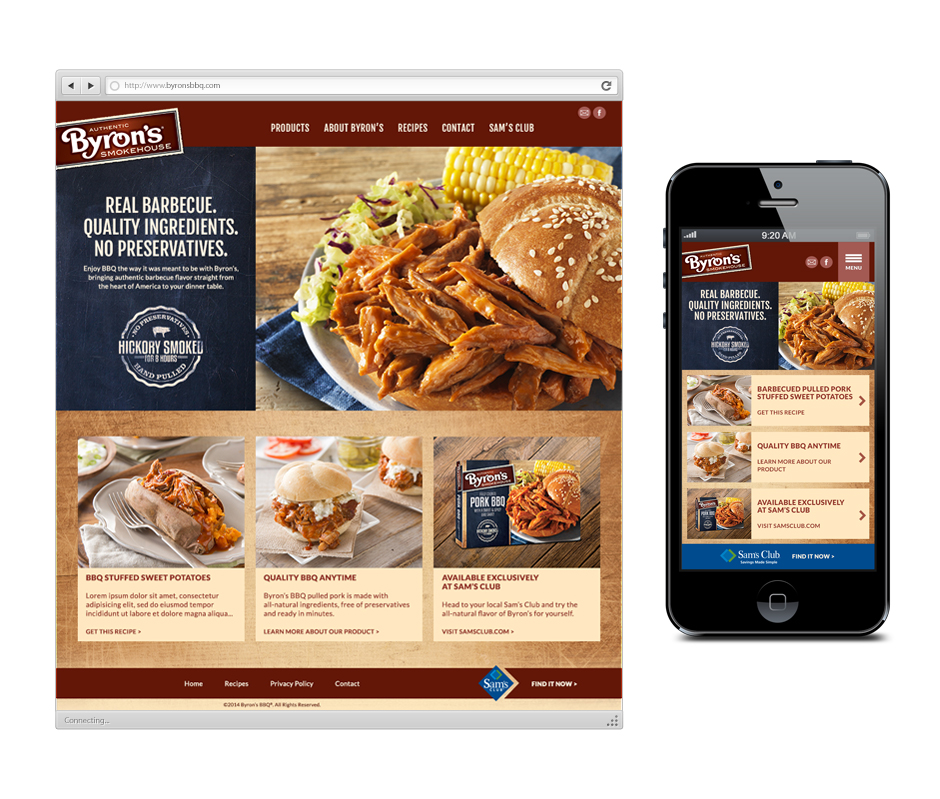
With a new responsive visual website, Byron’s BBQ is poised to attract new customers, as well as provide returning loyal fans with information on various product offerings and featured easy-to-prepare recipes. The redesigned website improves customer user experience, including the addition of a feedback form, as well as a one-click redirect to Sam’s Club online store where customers can purchase Byron’s BBQ exclusively.
Like many of it’s sister brands such as SeaPak and Farm Rich, Byron’s BBQ caters to busy moms and their families. One such mom is Lisa, a mother of three growing boys. She loves to be able to easily prepare a no hassle barbecue dish like pulled pork sliders, and purchasing at Sam’s Club fits her budget.

But the previous website was visually outdated, and had no clear indication on the homepage as how to purchase Byron’s BBQ. This disjointed user experience resulted in the loss of potential revenue, especially from frustrated customers who prefer to make their purchases online.

First and foremost, the redesigned website aims to increases purchase intent by making it convenient for customers to go to Sam’s Club online from any page of Byron’s website. New food photography has great appetite appeal, with plenty of easy-to-follow recipes requiring just a handful of ingredients to prepare as appetizers, snacks or dinners. Lisa also appreciates that the new website is mobile-friendly, so recipes are portable, whether she needs it to quickly reference in the kitchen, or to look up ingredients at the supermarket.

The website is built on a 960px 12-column grid. Depending on the content, pages will use one, two or three varied-sized columns in the main content area of the body.

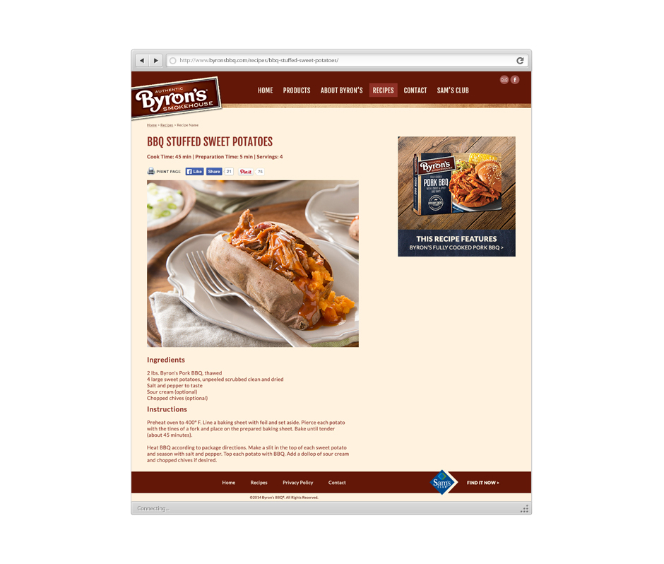
Lisa can choose from a list of mouthwatering recipes to help her decide what to cook for dinner.

Following the instructions, Lisa’s on her way to preparing a scrumptious barbecue meal.